A new graphic universe for a genuine, honest and diverse brand
CLIENT: DOCa RIOJA CATEGORY: BRANDING, STAND
The RIOJA Qualified Denomination of Origin asked us to create a new graphic universe and a visual system that would allow it to express the values that define it as a genuine, honest and diverse brand.
To do this, we needed the new graphic universe to also align around these same axes and constitute in itself an attractive and differentiated value proposition, as well as inspired by the essence of the brand.


The creative solution drinks from the images, colors, flavors, textures, people and the way they mix, mature and transform, evolve and age, transforming into new sensations.
They become forms and representations, brush strokes, footprints and grooves, dregs, marks and sketches of landscapes, evocative strokes that become the graphic support on which to build the brand´s universe. The textures combine with each other, sometimes with neutral and elegant results, at other times with more risky and fresh sensations.

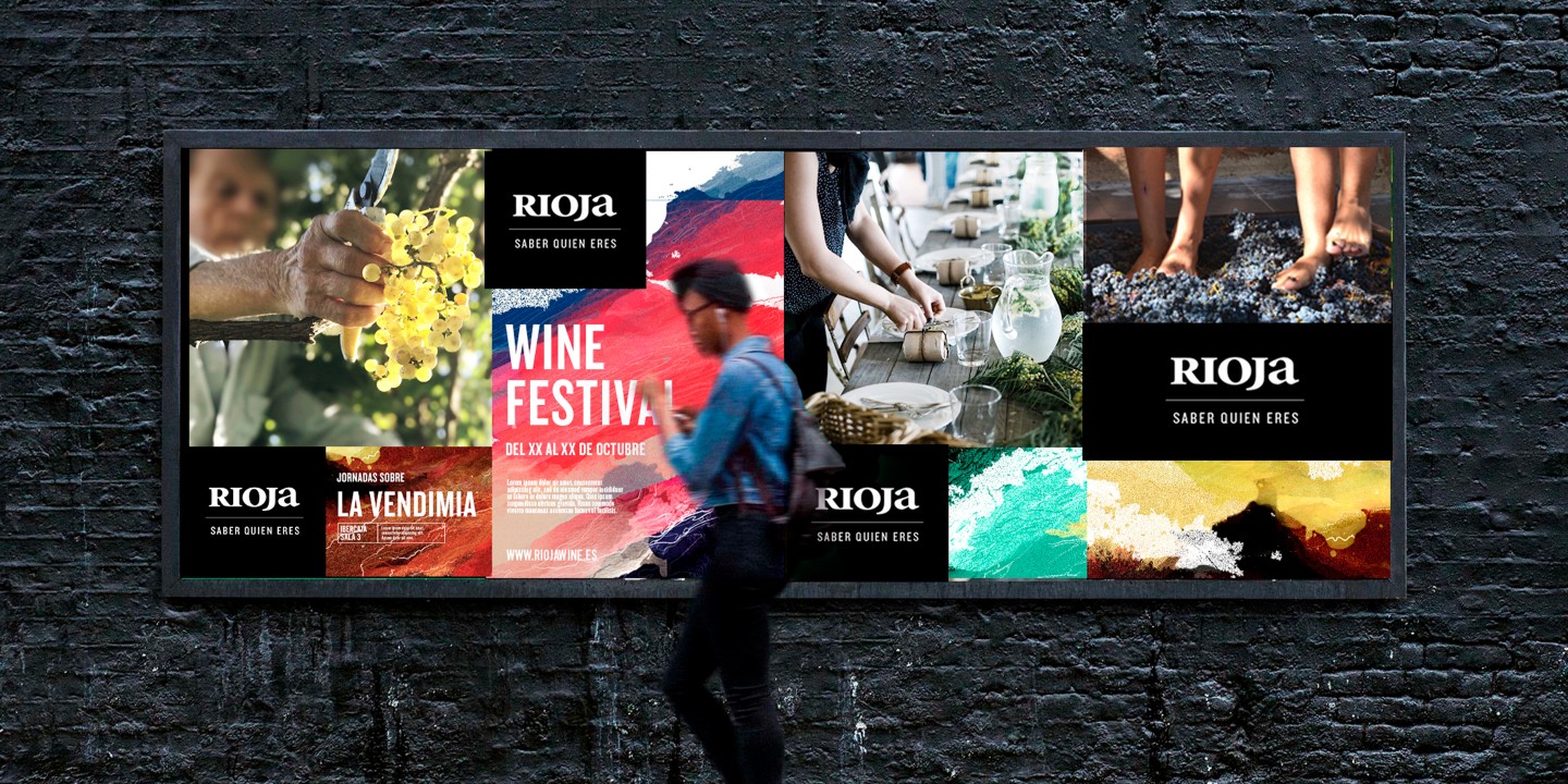


Elegant and sober, placed on a black heel, the RIOJA logo stands out in a balanced and distinguished way throughout the different expressions generated from the graphic universe.
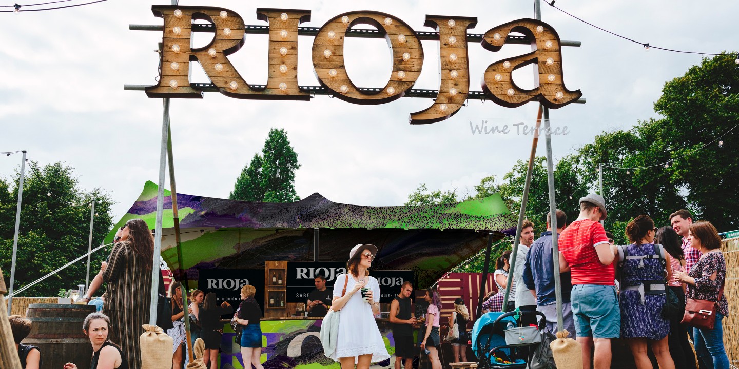


A brand and a visual system of great wealth and versatility, elegant and sober, risky and plural, rooted and real.


The graphic universe of Rioja.
.