CLIENT: Grupo La Navarra CATEGORY: BRANDING, CAMPAIGNS, PACKAGING
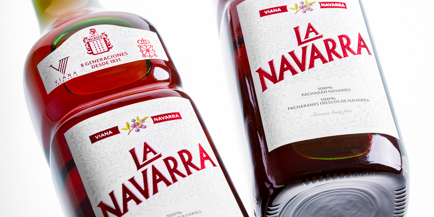
Throughout 8 generations, the Belasco Family has carefully elaborated Pacharán La Navarra in the search for a balance between tradition and innovation, flavor and authenticity, complexity and purity. This harmony had to be part of the redesign of the brand´s visual image and the labels of the iconic bottle.
The new brand proposal transmits a greater dynamism, accompanied by small features and details that confer personality and contribute to refresh the image and update it for the current generation of consumers.
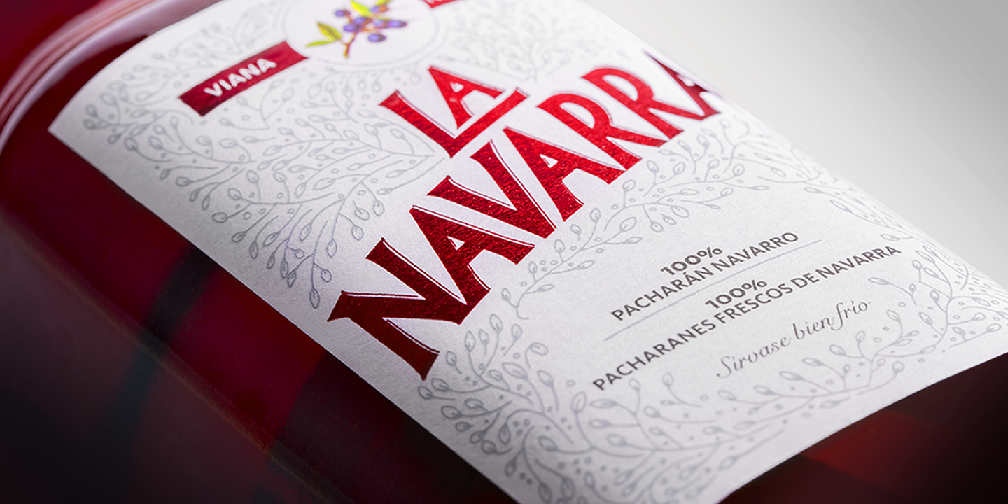
In the label, the space destined for the brand itself has been enlarged with the aim of increasing its visibility at the retatilers’ points of sale. At the same time, the included information has been reduced to focus the attention on the main messages. The composition is enhanced with the presence of a texture of organic shapes reminiscent of sloes’s fruits and with the crests of Navarra, Viana and the Belasco Family.
The final result invites the sensations from the liquor to pass through the walls of the bottle itself and, ultimately, underscore the authenticity and personality of this 100% pacharán from Navarra.
So easy, so complex.
Pacharán La Navarra. The authentic pacharán.
·

·

·